
Milan Cacic
April 01, 2022
Money Social media Economy Commentary In the news Trending Weekly update Weekly commentary


"INVERTED YIELD CURVE" - NOW WHAT?
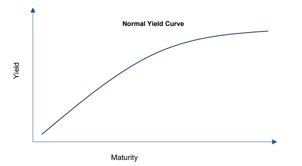
A yield curve is a graphical representation that plots yields of bonds at the same credit quality over different maturity dates. Under normal economic conditions, longer term-to-maturity bonds have a higher yield compared to those of shorter term-to-maturity bonds. A typical yield curve would have an upward sloping shape, as illustrated in the graph below.
However, changes in economic conditions can have significant changes on bond yields. For example, at the start of 2022, we saw a dramatic increase in short-term interest rates because the market priced-in expectations that the central banks would raise interest rates to combat inflation. What ended up happening was the 2-year government bond yield rose up to almost the same yield as the 10-year government bond yield. This is called the “flattening of the yield curve”, which basically means the interest you earn on a 2-year bond is almost the same as the interest you’d earn on a 10-year bond. Sometimes, in more rare circumstances you can get what is called an "inverted yield curve". This means that the interest you earn on a 2-year bond is higher than the interest you earn on a 10-year bond.
What does a flattened or inverted yield curve tell us?
Historically, when the yield curve inverts, it’s a good indication of an upcoming recession. Higher short-term yields combined with lower long-term yields implies that investors are expecting economic growth to slow down. If we get to the point where short-term rates are higher than long-term rates (inverted yield curve), then the bond market is telling us that the central bank will push the economy into a recession.
The chart below is a graph of the 10-year US treasury yield minus the 2-year U.S. Treasury yield referred to as the "10-2 year treasury yield spread". If the graph is in positive territory, then it indicates we are at somewhat of a normal yield curve. When the graph goes negative, it means the shorter term interest rates are higher than the long term interest rates (inverted yield curve). The grey part of the chart also highlights some notable historical recessions [2020, 2008, 2001, 1990, 1981 and 1980].
As you can see from the chart below, every time that the yield curve has inverted a recession has followed within 2 years. You can also see from the chart, that at the time of writing we are very close to an inverted yield curve. If the yield curve inverts, we can expect a recession sometime within the next 2 years. Obviously we watch this closely and will make the appropriate adjustments. Typically, those adjustments would be to reduce risk levels. For example, we would likely decrease exposure to high-yield corporate bonds and increase our quality holdings, such as in North American large-cap stocks and defensive sectors such as utilities. I should also note that the markets do not tend to react to an inverted yield curve in the first few months after it inverts.
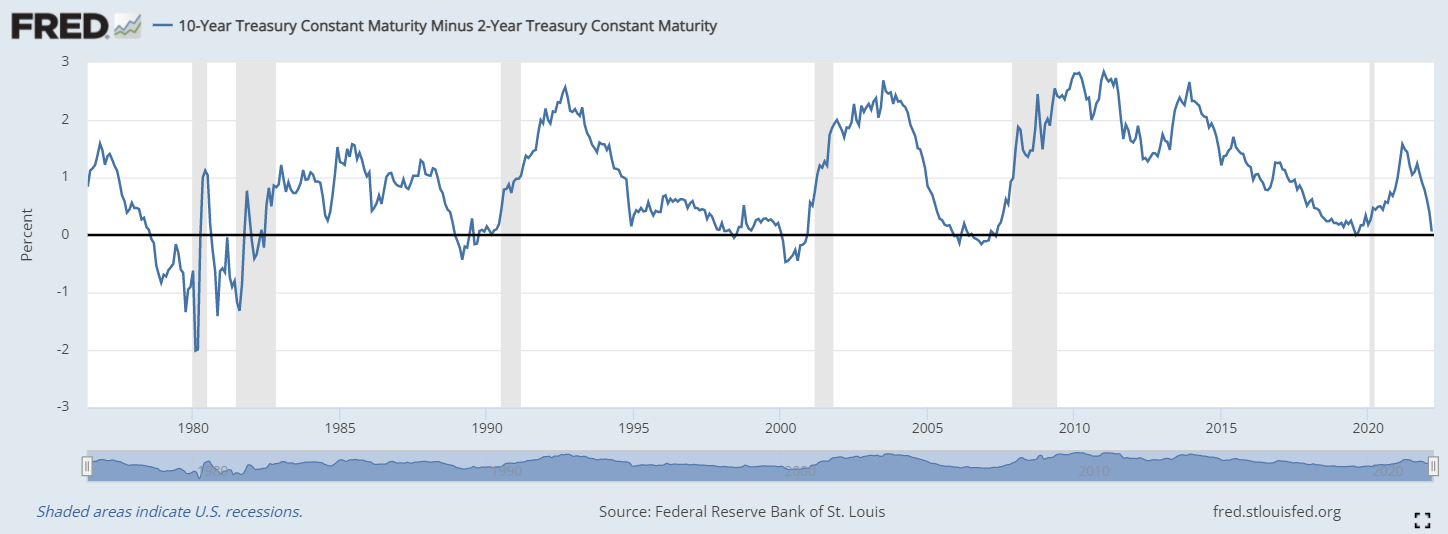
Source: Federal Reserve Bank of St. Louis, 10-Year Treasury Constant Maturity Minus 2-Year Treasury Constant Maturity [T10Y2Y], retrieved from FRED, Federal Reserve Bank of St. Louis, 2022
I've also included a piece from our CIBC Economics Team entitled "Canadian rate hikes: Where's the Finish Line?"
As always if you have any questions please feel free to give us a call anytime.
Have a great weekend.
Milan