Calvin Tenenhouse
February 03, 2026


A Picture Book for the Stock Market
Hello everyone, I hope you had a relaxing holiday season and are staying warm! In this posting, my goal is to answer some of the most common questions I’ve received from clients over the last few months by using a data driven and easily digestible approach.
Data was sourced from JP Morgan’s annual guide to the market. Enjoy!
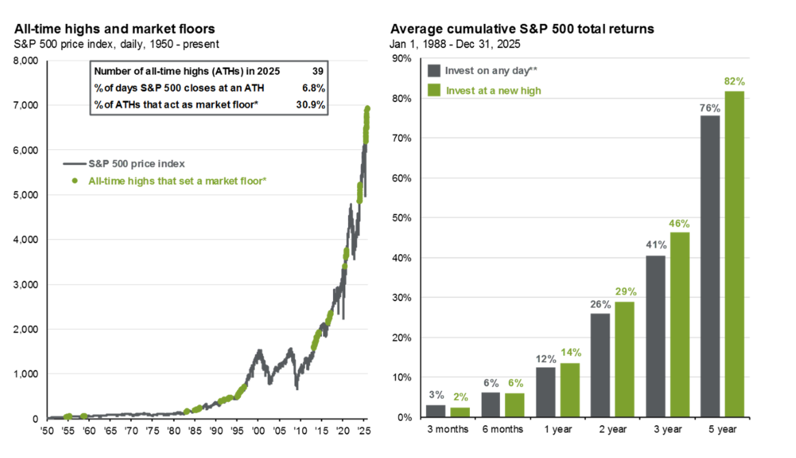
Should I be deploying cash at an all-time high?
Investors usually use all-time highs as a reason to stay in cash or on the sidelines. However, history suggests that investing at all-time highs is not a bad strategy as new highs are typically clustered together. In other words, market strength begets more market strength. On the left, we show the S&P 500 price index and mark each all-time high that set a “market floor,”. In fact, nearly 1/3rd of all-time highs act as a new market floor. Since 1950, there have been dozens of instances in which an investor sitting on the sidelines with markets near all-time highs would have never seen a better entry point. On the right, we show that returns from investing on any given day versus an all-time high are comparable and, in some cases, better when investing at market highs.
What return should I expect from my stock portfolio this year?
While no one can answer this question with absolute certainty, we can look to historical data to help provide some guidance. These charts demonstrate the historical relationship between forward P/E ratios (valuation) and subsequent 1 and 5-year returns. While there is little correlation between valuation and returns in the short term, starting valuations have a much greater predictive power over 5 years. Here are my insights
- Using the current market’s price level to predict the next 12 months is a fools game (as shown by the chart on the left)
- We believe with a moderate level of conviction that general market returns over a 5-year period will be slightly muted given current valuations. We would note that the managed portfolios we hold for our clients should not be viewed as proxies for market. The overall valuation of the “market” is skewed by highly concentrated positions in highly valued stocks (eg. Tesla, Palantir), which have much smaller representations in our portfolios, if at all.
- Over the long term, we should expect returns to gravitate back towards historical averages.

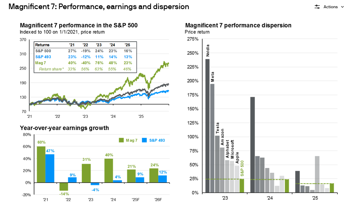
What is the Mag 7?
The "Magnificent Seven" (often shortened to Mag 7) is a term coined by Bank of America to describe a group of seven, high-performing, and influential US technology-related stocks that have dominated stock market returns. The 7 companies are Google, Amazon, Apple, Meta, Microsoft, Nvidia and Tesla.
Over the past few years, the Mag 7 have driven both positive and negative returns at the index level. The chart on the bottom left looks at the yearly earnings growth of the Mag 7 and remaining companies in the S&P500 (also known as the S&P 493), as well as estimates for 2025 and 2026. The chart on the right highlights that performance dispersion among the Mag 7 has widened over the years, with only a handful outperforming the S&P 500 in 2025.
Why don’t I own all of the Mag 7?
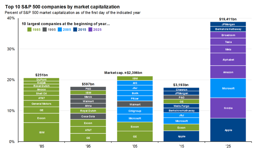
While an entire blog post could be written to discuss this question the answer can be summed up into one word – diversification. Our portfolio’s are built for downside protection which involves mitigating concentration risks. More importantly, in a rapidly changing world, the leaders of today are not often the leaders of tomorrow. In fact, only Microsoft has been able to retain its top 10 status between ’05-‘25.
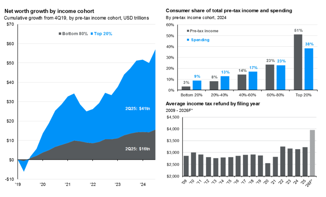
What is the K-Shaped Economy I hear about on the business network?
I think the best way to explain the K-shaped economy is to look at consumer spending in conjunction with Net worth. In the below chart, on the top left, we show cumulative net worth growth since 2019 by income cohort, with the top 20% of income earners enjoying over 70% of the wealth gains. This helps to explain why upper-income consumers have been so resilient. The top right chart shows the share of total consumer expenditures attributable to each income cohort. With the top 20% responsible for nearly 40% of total spending vs. just 9% for the bottom 20%. To summarize, economic activity has remained resilient despite weakness among lower income cohorts, further fueling wealth disparity and resulting in a K shape with each party moving in opposite directions.
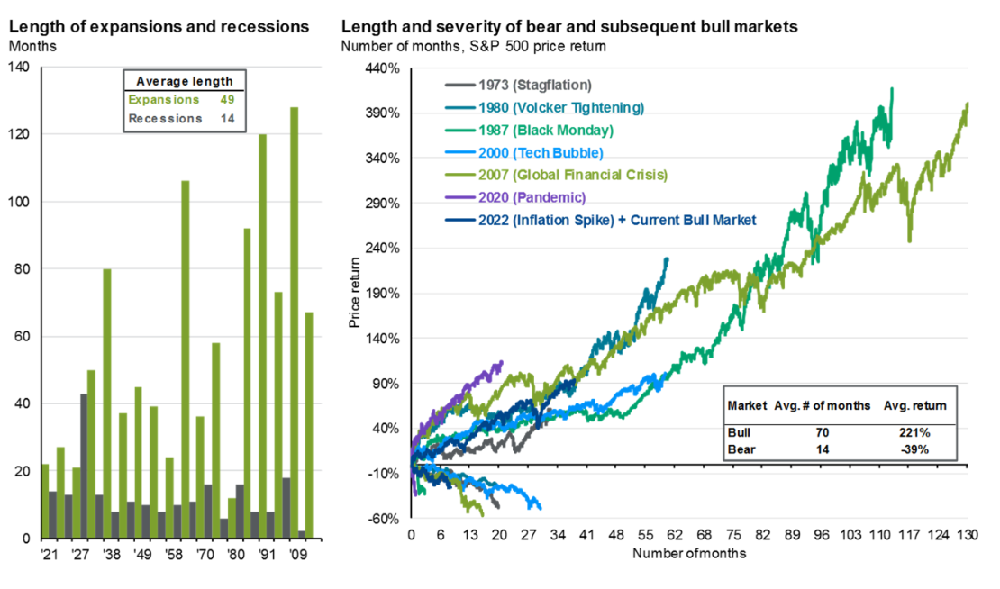
How long can this bull market last?
The stock market and economy in general are both known for long summers and short winters, spending far more time expanding than contracting. In the below chart, on the left, we show the length of each economic expansion in green and each recession in gray, going back to the 1920s. The takeaway is clear: expansions tend to last much longer than recessions. On the right, this pattern is mirrored in the equity markets. In the chart, each pair of lines, connected by their shared color, represents the bull and subsequent bear phase of a market cycle for the S&P 500. The average bull market runs for 70 months (almost 6 years!)
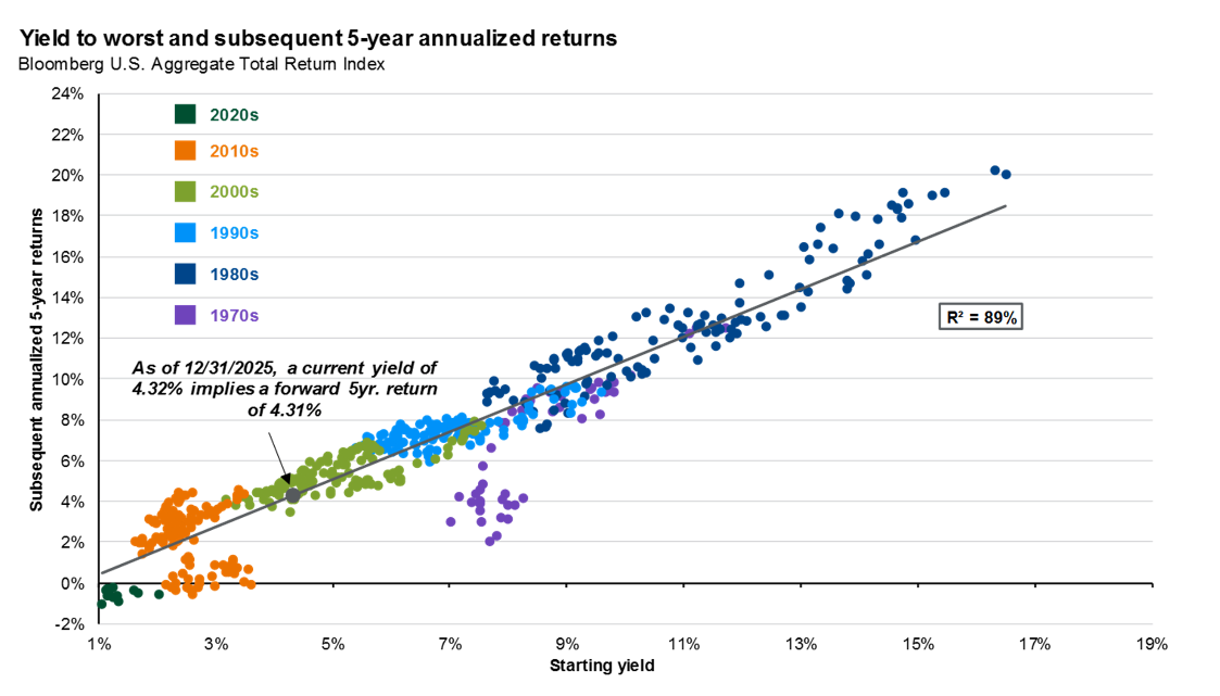
Why would I own bonds at all in this market?
Bonds continue to provide diversification benefits, predictable income and can act as portfolio stabilizers during periods of distress. They are also a source of liquidity to pull from for portfolio rebalancing. The chart below shows the high predictability of returns given any starting yield.
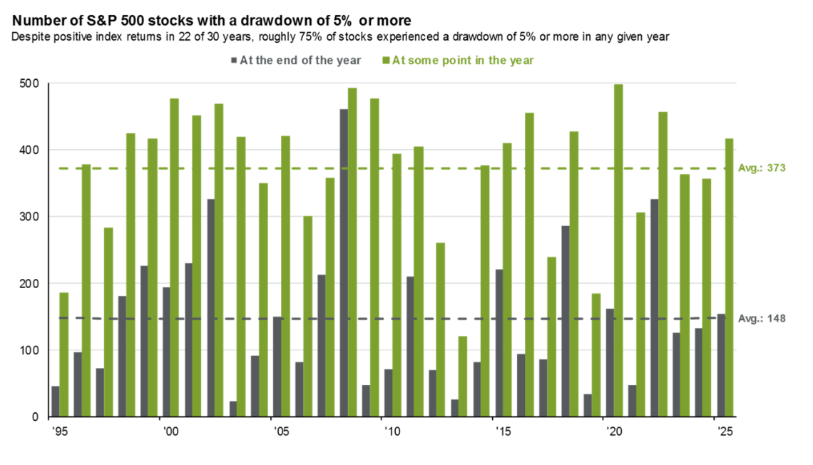
Should we give up on a position that is down since purchase?
On the chart below, we show the number of stocks in the S&P 500 that ended the calendar year down over 5% or dropped 5% or more at some point during the year (relative to where it started the year). The averages show that stocks experiencing a 5% drawdown is quite common. A few key takeaways from this chart are:
- Even good years for the market can be bad years for some stocks
- Bad years for the market are often times bad years for a large number of stocks, even if internal metrics are strong.
- 75% of stocks will fall by 5% or more on any given year. Don’t let short term price action impact the thesis for owning a business.
- We continue to focus on internal drivers of returns (free cash flow and earnings growth) which ultimately lead to share price appreciation.
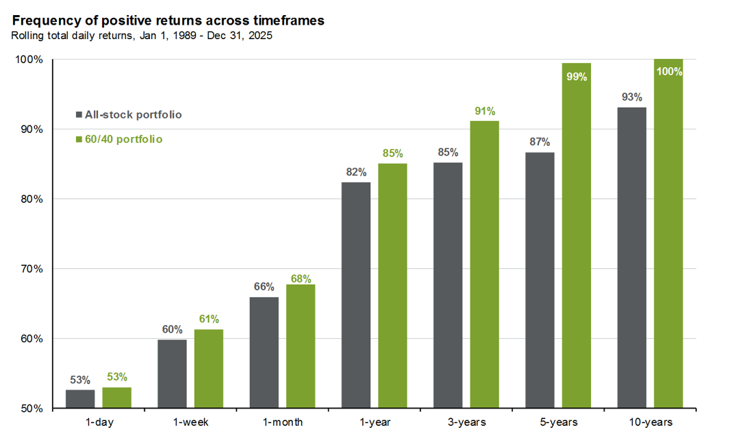
I’ve shared this charts many times over the last five years and the message remains the same. When your goal is long term wealth creation, volatility is of minimal concern. Over a one-day period, the market goes up almost as often as it goes down – essentially a coin toss. However, over a longer time horizon, the frequency of positive returns increases, with an all-stock portfolio being up over 80% of the time over any one-year period.
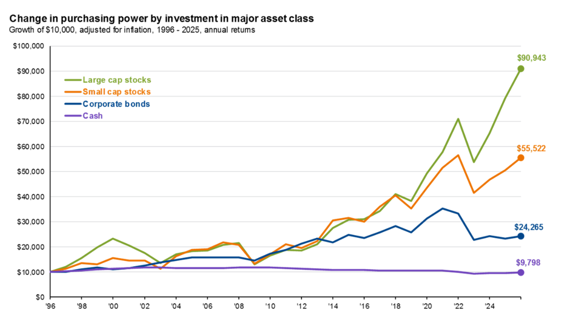
Contrary to what is often taught, bonds are not the savior from inflation. Owning stocks can potentially protects you from rising price levels as good businesses with pricing power are able to pass their costs along to the consumer.